

…design to inspire.
“I think cinema has this beautiful component. It's a universal language”
SNACKFLIX
Order your snacks and drinks ahead of time
Responsive Web Application design
Case Study
My roles: UX researcher/Visual Designer.
Project duration: Feb. 2024 - Feb. 2024.
Responsibilities: Paper and digital wire framing, low and high-fidelity prototyping, conducting usability studies, accounting for accessibility, and iterating on designs.
Tools used: Figma, Canva, Scketch, AI image generator.


After completing my previous case study, I advanced to the next phase of my design journey by developing a responsive web application catering to both desktop and mobile users. Leveraging responsive web design ensures optimal content viewing and an improved user experience compared to non-responsive applications. This approach ensures easy readability and navigation, making the app mobile-friendly.
So I began by creating an IA for Snackflix's responsive web app and organizing the structure in order to provide a high-level view of a product while keeping the user experience in mind for creating a new order of snacks and beverages that must be as smooth, hassle-free, and accessible to everyone.
So I created a fundamental IA that focuses mostly on two routes for the SNACKFLIX user: new order and track (existing) order.

The next step was to create paper wireframes. Before beginning, I established a list of elements that needed to be included in the wireframes to ensure that I tackle every aspect during the design process.
I want the user to be able to easily create a new order or track an existing order without searching for or scroll down for the appropriate button, so I believe it is more beneficial to have these two primary CTAs up front and above the fold.
Main nav. bar
Track order CTA
New order CTA
How it works
Account/profile
Footer

-
![]()
Home page - desktop
-
![]()
Sign in/up
-
![Choose your snack + menu]()
Choose your snack + menu
-
![Home page]()
Home page
-
![Choose your theater]()
Choose your theater
-
![Pick day and time]()
Pick day and time
-
![Choose your theater]()
Choose your theater
-
![Choose your snack]()
Choose your snack + menu
-
![Choose your theater]()
Choose your theater different option


Digital Transformation of the Wireframes
Transforming Initial Sketches into Figma Designs
While turning my initial sketches into digital designs using Figma, I made several improvements. I followed a design approach that focuses on users, aiming to create a clear and functional design.
At this stage I’ve created one user flow for Desktop and Mobile.

Mockup and Low-Fi prototype

Evolution from Figma Wireframes to Low-Fi Prototype
Following the creation of digital wireframes in Figma, the transition to building a Low-Fi prototype began, establishing the initial user flow. This phase involved continuous iterations, refining the wireframes to enhance the user experience and streamline the flow.

Testing
Usability study:
During a usability study, I did both moderated and unmoderated tests for the responsive web application.
My KPI’s were to determine whether user’s pass was clean and easy for them to reach from point A to B, begginig at the Home Page and ending at the Confirmation Page. Also one’s satisfaction was another important measure to be collected.
During this study - I asked the participants to create a new order from their Desktop device and feedback me about their process.
The mobile version will be iterated according to the desktop low fi prototype feedback.
Usability study findings:
When progressing from first step to the next one - there was no option to view the previously chosen step.
in the visually presented steps - it’s better to create some kind of indication (add colours) so I can see where I am at each stage of the ordering process
Review & Checkout page - I want to be sure I can make changes right before clicking the “buy now” option.
-
![]()
Payment confirmation CTA
The CTA button was replaced closer to the content in order to create better flow for users to follow the next step in the ordering process.
-
![Scrolling Menu]()
Scrolling Menu
The menu page has been modified with two scrolling options, search and filter, to better and faster navigate all available food and beverage selections.
-
![Titles and description]()
Page title and description
The titles for each page have been modified to make them more visible for the user, allowing them to better navigate and understand the purpose of each page
-
![]()
Track Order
The option to track an order right after payment has been implemented to the confirmation page, allowing users to follow their purchase immediately or for users who order ahead of time and wish to validate the details for their order.


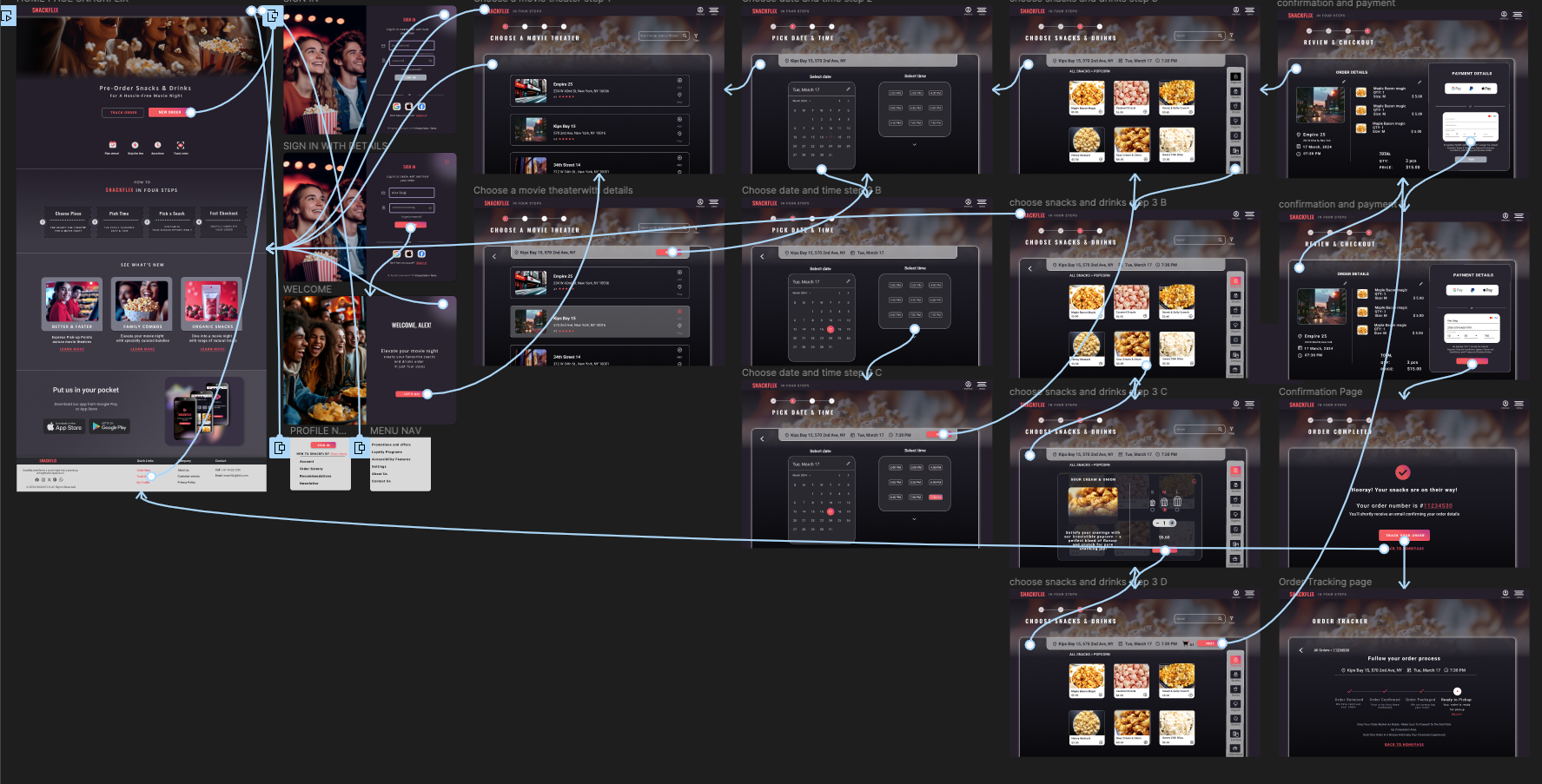
Following the initial usability study test - here is the final high-fidelity prototype presenting cleaner user flows for ordering and tracking snacks and beverages